10 Cool CSS Image Effects

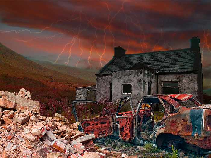
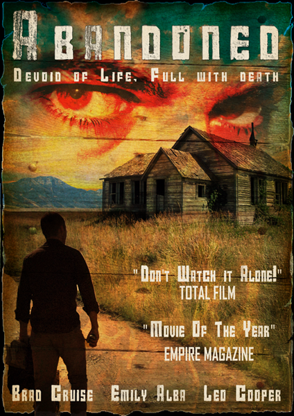
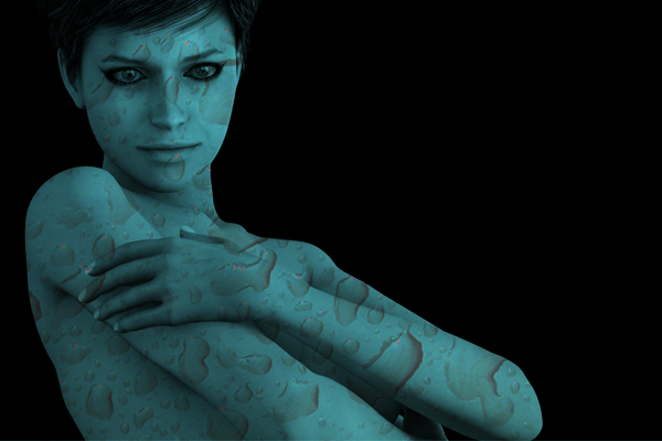
This Article outlines 10 excellent image effects for your website that can all be easily achieved using just plain old HTML and CSS. The image above shows just 3 of the effects that can be created, others included the Polaroid image effect, creating circular or elliptical images and even stacking multiple image on top of each other. The effects are listed in order of difficulty (in my opinion), so perhaps start with the first one and progress from there.
Image Rotation:
The HTML
The CSS
div.rotate
{
    -ms-transform: rotate(7deg); /* IE 9 */
    -webkit-transform: rotate(7deg); /* Chrome, Safari, Opera */
    transform: rotate(7deg);
}
Border With Drop Shadow:
The HTML
The CSS
div.shadow
{
    -moz-box-shadow: 10px 10px 5px #888888;
    -webkit-box-shadow: 10px 10px 5px #888888;
    box-shadow: 10px 10px 5px #888888;
    border:15px solid #ffffcc;
}
Layered / Stacked Images:
The HTML
The CSS
div.box1
{
z-index:1;
position:relative;
-webkit-transform: rotate(-3deg);
-ms-transform: rotate(-3deg);
-o-transform: rotate(-3deg);
transform: rotate(-3deg);
}

div.box2
{
z-index:2;
position:relative;
left:-150px;
}

div.box3
{
z-index:3;
position:relative;
left:-350px;
-webkit-transform: rotate(3deg);
-ms-transform: rotate(3deg);
-o-transform: rotate(3deg);
transform: rotate(3deg);
}
Circular Images Effect:
In the examples above the image is 200px high and wide with a border-radius of 100px. The key to creating circles is for the border radius to be half of the height and width.
CSS
img{border-radius:100px; height:200px; width:200px;}
Elliptical Images Effect:
In the examples above each box is 200px high and 300px wide with a border-radius of 50%. The key to creating ellipses is for the border radius to be 50%.
CSS
img{border-radius:50%; height:200px; width:300px;}
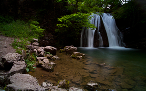
Polaroid Image Effect:
Waterfall Photo
The HTML
The CSS
.polaroid
{
position: relative; text-align: center;
}

.polaroid img
{
border: 10px solid #fff;
border-bottom: 45px solid #fff;
-webkit-box-shadow: 0px 0px 10px #777;
-moz-box-shadow: 0px 0px 10px #777;
box-shadow: 0px 0px 10px #777;
-webkit-transform: rotate (3deg);
-moz-transform: rotate (3deg);
transform: rotate (3deg);
}

.polaroid p
{
position: absolute;
text-align: center;
width: 100%;
bottom: 0px;
font: 400 18px/1 'Kaushan Script', cursive;
color: #888;
z-index:99; }
Description On Hover:
The HTML
The CSS
.image
{
overflow:hidden;
width:auto;
height:240px; /*should match your images height*/
}

.image-desc
{
text-align:justify;
position:relative;
top:-40px; /*allows the first part of the description to be visible*/
overflow: hidden;
font-size:14px;
padding:10px;
height: 200px;
color: #ffffff;
background-color: #000066;
opacity: 0.8;}

.image-desc:hover
{
position: relative;
top:-187px;
opacity: 0.8;
}
Map Pin Effect:
The HTML
The CSS
div.rotate
{
.pin
{
z-index:2;
position:relative;
top:18px;
left:0px;
}

.photo
{
z-index:1;
position:relative;
}

}
Paper Clip Effect:

The HTML
The CSS
{
.paper-clip
{
z-index:2;
position:relative;
top:18px;
left:5px;
}

.photo
{
z-index:1;
position:relative;
}

}
Masking Tape Effect:

The HTML
The CSS
{
.tape
{
z-index:2;
position:relative;
top:18px;
left:5px;
}

.photo
{
z-index:1;
position:relative;
}

}
10 Cool CSS Image Effects
 Reviewed by Opus Web Design
on
January 13, 2015
Rating:
Reviewed by Opus Web Design
on
January 13, 2015
Rating:
Reviewed by Opus Web Design
on
January 13, 2015
Rating:


