7 Tips to Improve Your Website’s User Experience

Don’t you hate when trying to navigate a website to find information quickly, but the load times are slow, there is technical jargon that is difficult to understand, and the text is difficult to read or ALL IN CAPS LIKE THIS? Most people would leave such a website almost immediately.
Website User Experience (UX) is the process of designing a website around the most favorable flow and usability for the intended user. Top Atlanta web design companies have been studying the best practices around user experiences for the last 20+ years, and it has become so important that now search engines rank it as one of the most essential elements of a search engine results page.
The broadened view of User Experience is that users must find value in what you are providing. Peter Morville, the pioneer of Information Architecture and User Experience, represents this value through this User Experience Honeycomb.
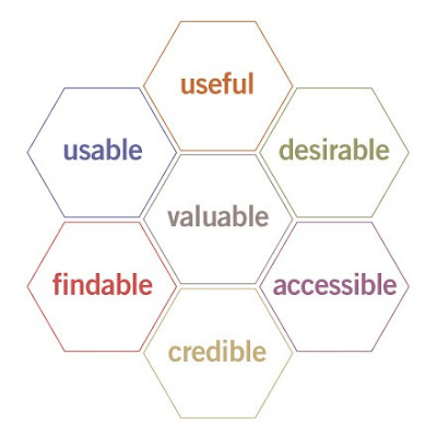
He notes that for there to be a meaningful and valuable user experience, information must be:
- Useful: Your content should be original and fulfill a need
- Usable: The site must be easy to use
- Desirable: Image, identity, brand, and other design elements are used to evoke an emotion and appreciation
- Findable: Content needs to be navigable and locatable onsite and offsite
- Accessible: Content needs to be accessible to people with disabilities
- Credible: Users must trust and believe what you tell them. The old adage, “know, like, and trust.”
Expanding on these items, here are seven tips to improve your website’s user experience.
Mobile Optimization
Adjusting your site’s user experience to have equal quality and function on a mobile device as it does on a desktop device is creating mobile optimization. The content easily fits on a smaller screen, the font might be a larger size, so it is easier to read, and pictures and videos continue to load quickly.
The written content on a page should also be easily scrollable on a single page and not set up so that the user would need to click through multiple pages. Content should be written in shorter paragraphs rather than longer so that it is easy for the eye to quickly scan and not appear as a “wall of text.”
Mobile devices now dominate a significant portion of the online space. To be effective, businesses need to make sure that content is easy to engage with regardless of the device.
Simplify Navigation
Think of your website as a road with users seamlessly cruising from one section to the next in order of what that user’s needs are. Without a well-thought-out navigation structure, your user may have trouble maneuvering your product and abandon the site altogether.Users are more likely to notice items at the top of the page and follow along in order of importance. Creating menus, drop-downs, and call-to-action buttons will simplify wording and improve the website’s ease of flow.
Valuable, Concise, and Clear Messages
As mentioned, users start at the top of the page and quickly scan the first 2-3 words at most. Because of this, it is vital to have your most important information in this top section, and it must stand out from other information on your site.It is also essential not to use too many words to convey your message. Keep it clear and concise.
Example: “You can click here to subscribe to our newsletter.”
“Click to subscribe.”
Always use shorter sentences and skip the technical language. There’s no need to test linguistics skills on a webpage, so if a word has a simpler term, be sure to use it. And remember, the user doesn’t care what the company has to say as much as they care about the few points they need to know.
Contrast and Color
The ultimate goal of a website is for the user to stay as long as possible and click any call-to-action. But if a user is unable to see or determine where that button or link is due to color, this can cause unnecessary frustration, and oftentimes the user will leave never to return. If the user is colorblind or has visual impairments, they may not be able to see these elements properly, if at all.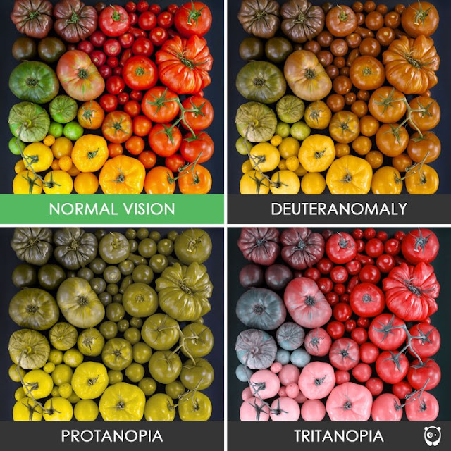
The color blue is used by default for links and should not be used in any other text on your website. Call-to-action buttons should have their specific color as well which is not used anywhere else on your site. If color is not your strong suit, there are a plethora of color palette tools out there that are specific to designing a website for the best user experience. Remember also to convert your designs to greyscale, so color-blind users can also read your information.
Speed
Web page speed is increasing in importance to the user and for search engine results page rankings. Users are now expecting web pages to load in two seconds, and 40% of users will abandon a site after three seconds. Pages with a longer load time tend to have higher bounce rates and lower average time spent on pages. Users also expect their mobile experiences to equal the speed of those on desktop experiences. Website developers should make sure users can complete their primary goals quickly and easily.
What matters the most is that a website feels fast, even if that is only an idea. Andrew Kucheriavy, Founder and CEO of Intechnic, states “Perception of website speed is based on load time, load behavior, waiting times and smoothness of animations.” One way to navigate this is for designers to have text load on pages before the images load so users can start reading the content before waiting for the rest of the page. They can also show a skeleton of the website layout during the loading process.
Users are more apt to hang around for a few more seconds if they perceive the website is loading quickly and they have something to read in the meantime. Several page speed analysis websites give insights and suggestions on what might be slowing down your speed and what you can cut out.
Include a Search Box
Unless you have a very small website with little content, do your users a favor and include a search field. There is nothing worse than searching for a specific need, finding a website, then not being able to find that thing you’re looking for within the website. It should also be noted that the search box should be easy to find. The most common practice is to add a text box to the top right corner of the site. This should be streamlined throughout the user’s mobile experience as well.
When setting up your search function, remember back to tip number three: you should have valuable, concise, and clear messages. For a medium to more extensive size website, there has been a success with users finding and using a search field that just has a magnifying glass icon rather than text to let users know they can perform a search there. Designers of content-heavy websites should think about including the search field within the menu bar. This search field could consist of a sample search query and ideas on what could be explored within the site.
Help vs. FAQ
Users are reluctant to use the website’s Help pages. Rather than a wordy page or one that a user might feel they won’t talk to a human, consider a wizard or FAQ. “An effective FAQ can educate, inform, and guide the user in a natural way through your website’s content and toward the goals and end results you have set.”(www.searchenginejournal.com).
FAQ pages are one of the easiest ways to improve your site user experience and also optimize your site for search engine rankings. While answering frequently asked questions, it is common to add an exact phrase that has been searched for before. In turn, when this phrase is searched again on a search engine, your website is more likely to be found based on that data.
A useful FAQ page should:
- Reflects your target market’s needs.
- Have frequent updates based on insights and data.
- Land new users on the website by solving their problems.
- Promote page views to other essential pages on the site through internal links.
- Create additional content (blogs).
- Demonstrate authority, knowledge, and trust within your niche.
User Experience is Crucial for Search Engine Ranking

All things considered, if you want your website to be found in the abyss of the world wide web, you must keep the user experience at the forefront of your design mind. Google uses artificial intelligence, called RankBrain, to track specific actions a user would make on a website that would correlate with a good, or not-so-good, experience. Some of these actions are Click-through Rate (the percentage of people who click onto your site from a Google search result page), Bounce Rate (those who make it to your page, but almost immediately “bounce” back to the search results), and Dwell Time (how long visitors stay on your site once they’ve arrived).
What this boils down to is web developers and design firms will prioritize user experience for their clients. The client should put an equal amount of energy into the content that is created, as they would an in-person experience. If a website has content that the user loves, Google will recognize that and send more users to it. No matter what, always start building a website with the user in mind.
 Reviewed by Opus Web Design
on
April 22, 2021
Rating:
Reviewed by Opus Web Design
on
April 22, 2021
Rating:


