Colour Theory
 |
| If you understand the theory of colours you are better placed to choose the right colour for the right job |
What is Colour?
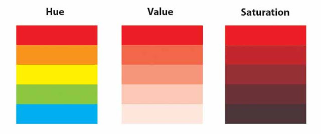
Colour is how the eye perceives reflected light. What I will explain here are the three main components of a colour: hue, value and saturation. |
| colour properties |
- Hue is where a colour is positioned on the colour wheel. Technically the hue is the colour which it a design element in itself.
- Value is the darkness or lightness of a colour and is a design element in itself.
- Saturation is the intensity of a colour.
The Colour Wheel
 |
| The Colour Wheel |
The colour wheel can be seen above and this can be used to help remember primary and secondary colours. The secondary colours are in between the primary colours - for example - between red and blue is purple. Quite simply, mixing the primary colours of red and blue paint together will produce the secondary colour purple.
An important rule of the colour wheel is that colours opposite to each other on the colour wheel usually work well together as a colour scheme. These are known as complimentary colours. Complimentary colours are often used together in graphic design as they tend to give the image/graphic a sense of balance and are visually more aesthetic.
Primary Colours
These are colours that cannot be created through the mixing of other colours. They are colours in their own right. The three primary colours are RED, YELLOW and BLUE. Primary colours can be mixed together to produce secondary colours.
YELLOW + BLUE = GREEN
BLUE + RED = PURPLE
RED + YELLOW = ORANGE
Secondary Colours
The secondary colours are in between the primary colours on the colour wheel to depict the mixing of the primary colours on either side to create the secondary colour between. The formulae below show the combinations required to produce secondary colours.
YELLOW + BLUE = GREEN
BLUE + RED = PURPLE
RED + YELLOW = ORANGE
Complimentary Colours
As already mentioned, the complimentary colours are those opposite to each other on the colour wheel and which, when used together in a design, are more visually aesthetic or "pleasing to the eye". The complimentary colours are...
RED and GREEN
YELLOW and PURPLE
BLUE and ORANGE
Meaning of Colours
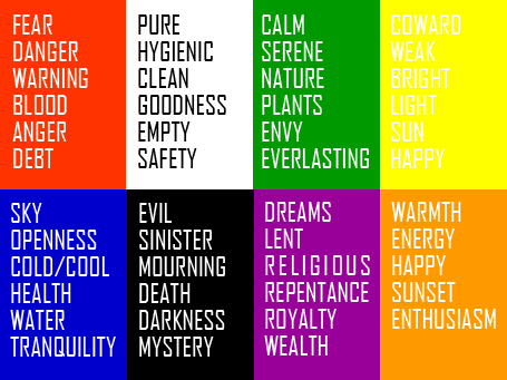
Designers have a large range of colours at their disposal and most are well aware that certain colours are associated with feelings and emotions. The diagram below show a number of popular colours and the feelings/emotions to which they are associated. Designers, companies and manufacturers use colours cleverly to promote a certain feeling about their products. |
| meaning of colours |
Colours in Context
Colours also have an effect on your visitors before they begin to read the content of your web site or printed design. Thus, it is very important for you to consider your target audience, the psychology of colour, and the corporate image you wish to project BEFORE you complete your design. |
| Colour can have different meanings in different scenarios |
Using Colour
When colour is used correctly, it can add impact and clarity to your message and highlight important points. Alternatively When colour is used incorrectly, it can compromise your message and confuse your target audience.
Colour can work for your web site and printed materials in various ways:
The interpretation of a colour depends on culture, profession, and personal preference. In general, the colours red, orange, and yellow are "exciting" colours and the colors purple, blue, and green are "calming" colours.
Interpretation of colour is not always a matter of personal preference. For example, in Western cultures the colour white symbolizes purity; however, in China the colour white symbolizes death.
To summarise, it is very important to consider your target audience, the psychology of colour, and the image you wish to project before you construct your web-site, printed materials, and logo.
For information on creating your own colour scheme for a design project see the colour schemes section.
- Colour emphasizes, highlights, and leads the eye to important points or links.
- Colour identifies recurring themes (i.e. titles and subtitles are usually the same colours).
- Conversely, colour can differentiate, such as different colours in pie charts and bar graphs.
- Colour symbolizes and triggers emotions and associations.
The interpretation of a colour depends on culture, profession, and personal preference. In general, the colours red, orange, and yellow are "exciting" colours and the colors purple, blue, and green are "calming" colours.
Interpretation of colour is not always a matter of personal preference. For example, in Western cultures the colour white symbolizes purity; however, in China the colour white symbolizes death.
To summarise, it is very important to consider your target audience, the psychology of colour, and the image you wish to project before you construct your web-site, printed materials, and logo.
For information on creating your own colour scheme for a design project see the colour schemes section.
Colour Theory
 Reviewed by Opus Web Design
on
November 26, 2015
Rating:
 Reviewed by Opus Web Design
on
November 26, 2015
Rating:


