Using Negative Space in Design
 |
| Negative Space Design In Motion! |
“Is negative space the space you don’t like, or the space that is not there? And if it’s not there how can you tell?” -Emma Bull
Proper usage of negative space can really enhance your design whether it’s for a website or print media. So what is negative space you might ask, well negative space is space that is inherently empty, in short it is the space around and between your design elements. Using negative space is beneficial as it can balance out your projects. Plus, it lets people know that you took time in figuring out your design. Below you can find some ways to better use your negative space as well as look at a few examples that use it effectively.
Emphasis
Negative space acts in many roles when it comes to your designs. One of the most obvious is it brings emphasis to certain elements of your design. Negative space when used effectively can act as a visual leader to the eye, in other words it leads the eye to where the designer wants it to go. In order for this to be done proper planning must be done which should be considered when you are prototyping. A great way to create emphasis to a certain section of your design is to design while using the negative space as a separator.Separating objects in some variable manner keeps your design looking clean and organized...
Separating objects in some variable manner keeps your design looking clean and organized all the while giving your design breathing room and allowing viewers to take their time in viewing what you have to offer. Negative space as a separator is also an effective way to differentiate all the design elements you have going on as well and if you use strategic placement you can even create an image.

Prototyping
...the best method of prototyping is to use shapes as substitutes for what will be in its place when you finally design...
Simplify
Simplifying your design where applicable can help you make the most out of the negative space you have to utilize. A lot of designs, both websites and logos have been increasingly going over to minimalism for an effective result. Why? Well simplifying your designs allows for your final result to be more accessible, that is, it is easily recognizable and readable. If you haven’t noticed minimalism is widely preferred. If you’re thinking about scaling back on your design to let the negative space shine through it is recommended that you remove or rearrange some of the elements present. Ask yourself what you do and don’t need and if you do need it and is there another place the element can be placed. Your design will eventually look less cluttered and more appealing.Size.

Adding variation in size when it comes to your design is pretty simple. Using a hierarchy or some form of can easily add balance and harmony to your design. By not designating every element the same size negative space is freed up. There are many reasons to why you would want to offer your elements in various sizes, one being you can easily create the illusion of another image within your design, you can navigate the eye to where you want it and you can also create a sense of movement and energy.
Sample Negative Space Logos
When you design you don’t always have to include all the bells and whistles, sometimes you will find that simplicity and minimalism works best. As the great Plato says, “Beauty of style and harmony and grace and good rhythm depend on simplicity.” That quote can’t be any more appropriate for the art of logo designing and it really comes into play when designing a negative space logo.Negative space usage in logo designs is steadily becoming popular among the design community.
Despite what you might believe at first glance, these seemingly simple and clever designs aren’t as simple as they may appear. Designing a visually appealing negative space logo requires not only a lot of creativity and talent but the ability to yield a logo that also reflects the message of client.
Below you will find some cleverly designed logos followed by a brief insight on why I think these logos work. Creating a negative space logo is a complex task and requires you to put your brain to work. Hopefully along the way you will find yourself inspired and challenge yourself in designing your own negative space logo.
Texas Wine
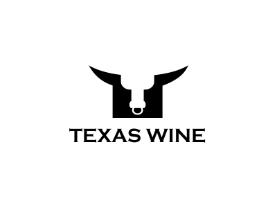
The Texas Wine logo is ingenious and simple. The logo itself is created from one image that relies on the negative space around it to actually generate the logo. The designer is using word association, in this case Texas and the image of a bull. The structure of the bull’s head also gives the allusion of an upside down bottle of wine bottle. The logo is effective in communicating the company’s name.
Banana Bird

Banana Bird logo gets right down to the point that the design itself could easily be identified without the company’s name. The overall bright yellow background really helps catapult the design and goes hand in hand with the banana design. The canny concept about this logo is that it is a dual image. At a glance it is just a bunch of bananas while in another glance upon seeing the small circle at the right will give you a view of a fat yellow bird with its wings lifted. The use of the tan shapes helps balance the image.
In the Woods
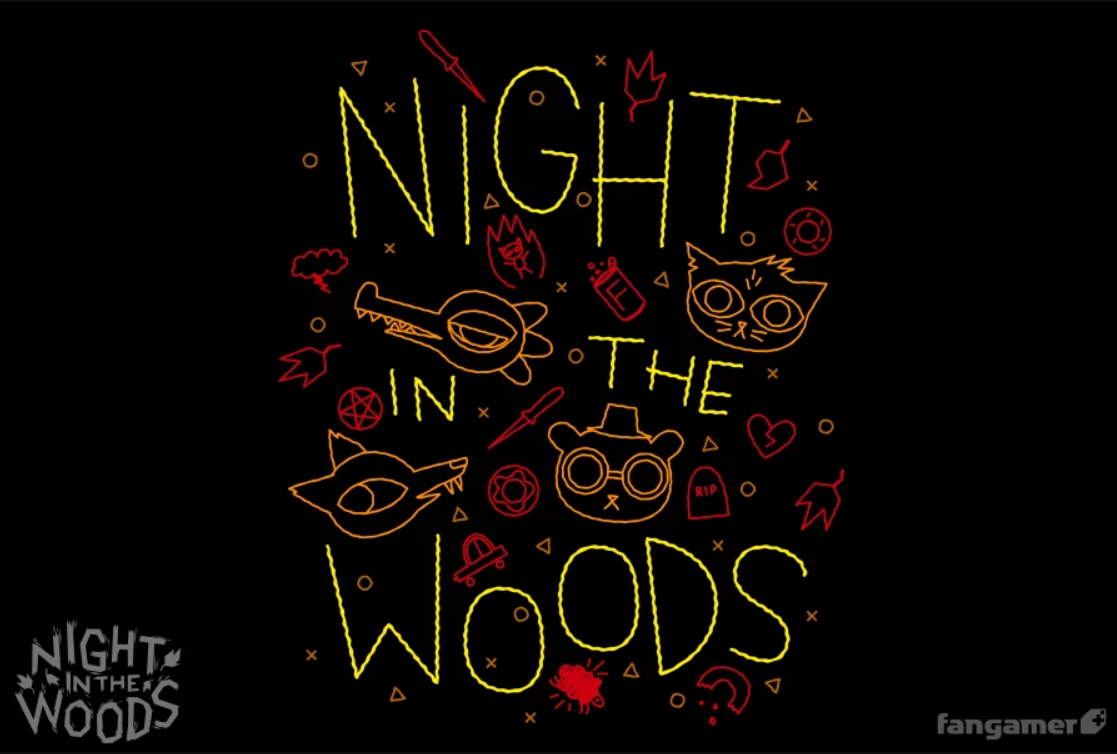
Mynus’ “In the Woods” design really takes creativity and utilizing negative space to a whole new level. Unlike most designs he actually uses an image, though subtle, as a backdrop for his logo instead of settling on a solid color. The use of a smoky brown color gives the logo an earthy feeling and works well with the forest theme. What really makes this logo stand out though is how it ingeniously fits four subjects (an eagle, a wolf, a tree and a bear) into such a small space without making the logo appear crowded.
Whitewashers

Incorporating the service, a company offer in a logo can be difficult at times. However, Whitewashers logo succeeded in that aspect and it is a brilliant design. Like the “In the Woods” logo, the “Whitewashers” takes on four designs (fence, paint brush, grass and the letter W) and seamlessly mends them together. The green background really allows you to see the grass better while the position and sizing of the fence posts shape a “W”. Another thing that is really creative with this design is how the grass can easily be interpreted as paintbrush bristles.
Two Knives

“Two Knives” offers a different technique compared to the examples above as it uses texture. The “2” and the font is covered in a wooden texture that immediately calls into mind the brown wooden handles seen on butcher knives. The design is subtle enough that two glances may be required to catch the placement of the two knives but the design completely works.
Hon-ay Deux

Here is another logo that uses color association and the Hon-ay Deux logo takes it a bit further by creating the image of a honey dipper, while hiding the letter “H” in the middle of it. This logo is minimalistic and simple yet very effective with getting the message across. The best thing of all is even without the text “honey” you would immediately associate it with honey regardless of if you saw the “H” or not.
Inside the Simple Kitchen
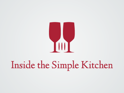
Bright colors such as red can really stand out with the use of negative space especially when you use a light background such as in the “Inside the Simple Kitchen” logo. The design may seem elementary compared to the previous logos but it still works and uses negative space adequately. By placing two glass next to each other the negative space in the middle is easily rendered as a spatula thanks to three well placed lines. The placement of the spatula also plays off the word “inside.”
Tips On Using Negative Spaces
As you can tell from the examples above, the key to design an effective negative space logo is simplicity and balance. Creating some logos will be easier than others. Therefore, keep drawing and tweaking your designs. For designing your own negative space logos consider the following tips:- Use colors. Sometimes black and white just don’t do justice to your design. If you think color will improve your logo and make it more recognizable than go for it.
- Look for inspiration. There are so many logo design galleries such as dribbble, logopond. Check out how other designers are creating their negative space logos and gather clues.
- Stay simple. Don’t overcrowd your design.
- Take a break, rethink and redesign
- Most importantly have fun when you’re designing and let your creativity flow.
Using negative space really isn’t as complicated as it may seem. Using basic designing point and asking yourself what you really don’t need are the best choices when trying to do your work.
About the author:
Nicholas H. Parker is a web developer. Besides, he likes writing. So he prefers to spend his spare time working for the cheap essay writing service. In this case, he has an opportunity to share his experience with others.
Using Negative Space in Design
 Reviewed by Opus Web Design
on
November 21, 2019
Rating:
Reviewed by Opus Web Design
on
November 21, 2019
Rating:
Reviewed by Opus Web Design
on
November 21, 2019
Rating:


