 |
| White Space Awaiting Creative Input |
White (Blank) space in graphic design is a good thing; however, many new designers have a hard time seeing the benefit of it within their designs. White space signifies a good composition, as a crowded space is never a good thing. White space has many positive attributes which this article will discuss and, regardless of the graphic design style being used, there is always room for some 'white space' .
Potential
 |
| This White Space Is An Opportunity |
White spaces are everywhere in a designer’s world, especially at the start of a project; the blank white page of a notebook, the blank screen awaiting a web page or the Photoshop canvas awaiting your creation. In fact, we can be thankful as long as we still see a white space around as it significantly tells us of the fact that there are still artistic creations waiting to be conceived.
Nobody Likes Clutter
Before doing any kind of graphics manipulation in a work-space
, the physical confinements of the designs are first laid out. A design impact’s potential is often encompassed by the physical confinements of the paper pages’ sizes. In composition, an entire work space is roughly blocked in first. The designer will then limit up the spaces needed to create his/her designs and the white space he/she will be leaving out. You shouldn't try to squeeze too much in though. A crowded and cluttered design is never good, as the image above aptly displays.
Simple Is Attractive
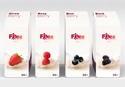 |
| Simple, Clear Packaging Making Good Use Of White Space |
The eyes tend to shy away from overflowing and overdone designs. As such, the amount of white space you have left out in your design might be the essential thing that will attract viewers and users. Composition can also be done by the proper arrangement of photographs, descriptive selling copy and headlines. Your consumer, viewer or users should always be taken into consideration during this stage of format development. Always keep in mind that the consumers use their eyes and not their mind in reflecting if a design element looks good or not.
Framing
 |
| The Simple Act Of Leaving White Space Around A Photo Allows The Viewer To Easily Focus On The Image |
In making a clean, dramatic frame for your photography, graphics, website or images, there may not be another best element than the use of white space. It will be appreciated by viewers and users of your web page very much since it is easy on their eyes. Studies have shown that there’s always a positive response towards a white space. It is because the white space allows a breathing space especially for important graphics like product photos, logos or ads.
Negative Space
 |
| Clever Use Of Negative Space In This Design |
Negative space may be most evident when the space around a subject, not the subject itself, forms an interesting or artistically relevant shape, and such space occasionally is used to artistic effect as the "real" subject of an image. The use of negative space can be a key element of artistic composition and is intrinsically linked with white space.
Unity & Focus
 |
| The "White" Space Is Black In This Classic Poster Design |
Your empty design element may not be entirely white, though. It can be any solid background color, but for the viewer it is still a white, blank, refreshing space that relaxes their eyes. Simply remember that this space is a very important ingredient in coming up with more effective and enjoyable designs and is the simplest way to unite all elements in your graphic design.


 Reviewed by Opus Web Design
on
February 24, 2016
Rating:
Reviewed by Opus Web Design
on
February 24, 2016
Rating:


